

Have you ever sat through a presentation and thought, “I could never make something that looks that good”? Many of us think we need serious design skills to create engaging presentations.
But with the right tools and techniques, even non-designers can craft captivating slides. This article will share seven essential tips to harness these tools and methods effectively. From storytelling to simplifying your visuals, we’ve got the insights you need to impress any audience.
Essential Presentation Tips for Non-Designers
Making a great presentation doesn’t need to be hard for people who aren’t designers. These tips will help you make your next presentation shine without needing expert design skills.
Start with a story
A good story grabs attention. Before you even think about slides, structure your thoughts with a story in mind. This helps your audience connect and retain what you’re talking about.
Think of stories that involve situations like trigger videos or role play. These can make your points vivid and memorable.
Knowing who sits in front of you makes a big difference too. Customize your story to fit the people listening. It’s not just about sharing facts; it’s making them care about what those facts mean through storytelling, flipping the classroom, or applying a ‘take-home message’.
Keep this up throughout your talk, adjusting as needed to keep everyone engaged.
Keep it simple
Keeping your slides clean and straightforward makes a big difference. You want people to easily read and understand what’s on each slide. So, choosing the right font size is key; it ensures everyone can read the text without squinting.
Busy backgrounds are a no-go—they just distract from your message. Instead, using your company’s template background or opting for flat colors keeps things neat and professional.
Stick to two types of fonts at most to keep viewers focused. And keep in mind, cramming too many ideas into one slide can lose your audience’s attention fast. Focus on one idea per slide; this way, every part of your presentation gets the moment it deserves without overwhelming anyone.
This approach makes for an engaging presentation and helps you tell a clearer story—one that sticks with people long after they’ve left the room.
Use supporting visuals
Supporting visuals can make your slides stand out. Think graphics, infographics, charts, diagrams, illustrations, photos. They help share your message without too many words. Stick to one idea per slide and aim for just a minute on each.
Make sure your headings are useful and only include key data.
Visual aids like photos or videos grab attention fast. They show what you mean better than text alone can do. Data visualization is very important in both speaking and writing about your topic.
It helps everyone understand complex info quickly and easily.
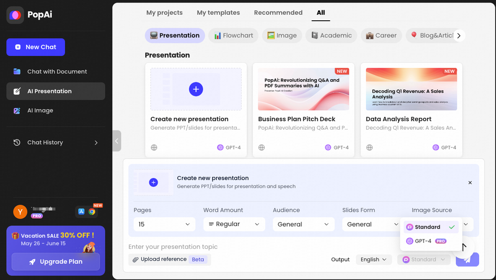
Use AI Tools for Presentation Design
For anyone who’s not a designer, making a professional-looking presentation might seem hard. But it gets easier with AI tools like PopAi. These AI tools for presentation design help you create slides that look great without spending too much time or effort.
You just need to give the content, and the software does its magic by making visuals that match your words. This way, even if you’re new to designing, your presentations can impress everyone.
Besides saving time, using an ai for presentation design ensures your slides are both appealing and clear. It analyzes what you want to say and comes up with the best way to show it visually.
Less is more
Keeping your presentation simple can make it more powerful. White space is not just empty space; it’s a key part of your design that brings elegance and clarity. This approach—embracing minimalism—means your main points come through louder and clearer.
Think about using fewer words, simpler designs, and letting the empty parts of your slide highlight what’s truly important.
Making mistakes is part of learning how to do this well. Each mistake teaches you how to improve next time, aiming for a clean, elegant look that holds people’s attention because it’s easy to follow.
Limit the use of animations
Moving right along from embracing simplicity, another key point is to be careful with animations. It’s easy to get excited and add lots of moving parts to your slides. But this can actually make things harder for your audience.
Too much movement can overwhelm and distract them. Instead of helping people understand your message, it might just confuse them more.
Animations should have a clear purpose. Use them only if they help explain something complex or add meaningful insight to your talk. This way, you avoid unnecessary distractions and keep everyone’s focus on what really matters – the information you’re sharing.
Choose the right font size
After limiting animations, picking the right font size is your next step. Fonts must be easy to read from far away. This means using a 32-point font size or larger for your texts. Choose sans serif fonts like Arial Rounded MT Bold because they are clearer and simpler to see from a distance.
Keep in mind, visual appeal also comes from how you arrange your text sizes. This creates what we call a visual hierarchy, making it easier for your audience to follow along and understand important points quickly.
Sticking with up to three different fonts in one presentation will prevent confusion and maintain a professional look. Avoid fancy fonts that might look fun but are hard to read during a presentation.
The goal is always clear communication through readable text across all slides, ensuring everyone in the room can easily follow your message without straining their eyes.
Conclusion
These seven tips for non-designers make presentations shine. Starting with a story grabs attention. Keeping it simple means messages stick. Using visuals helps explain your point. Less clutter means more impact and choosing the right font size keeps your slides readable. Finally, too many animations distract, so use them sparingly! With these tricks, anyone can create engaging presentations—no design skills needed!